As I have often lamented on Twitter, I’ve been disappointed that a large majority of indie games tend to focus on creating experiences similar to classic Castlevania or Metroid games. Zelda clones themselves have found their prominence too, but developers rarely try to create experiences that mirrors those of survival horror games. Games released for the likes of the original Playstation that had clunky but serviceable controls and a strong emphasis on resource management. Back In 1995 attempts to do just that, recreate this experience in a modern setting, but falls largely flat.
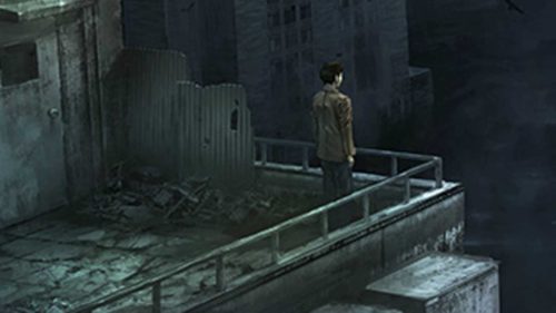
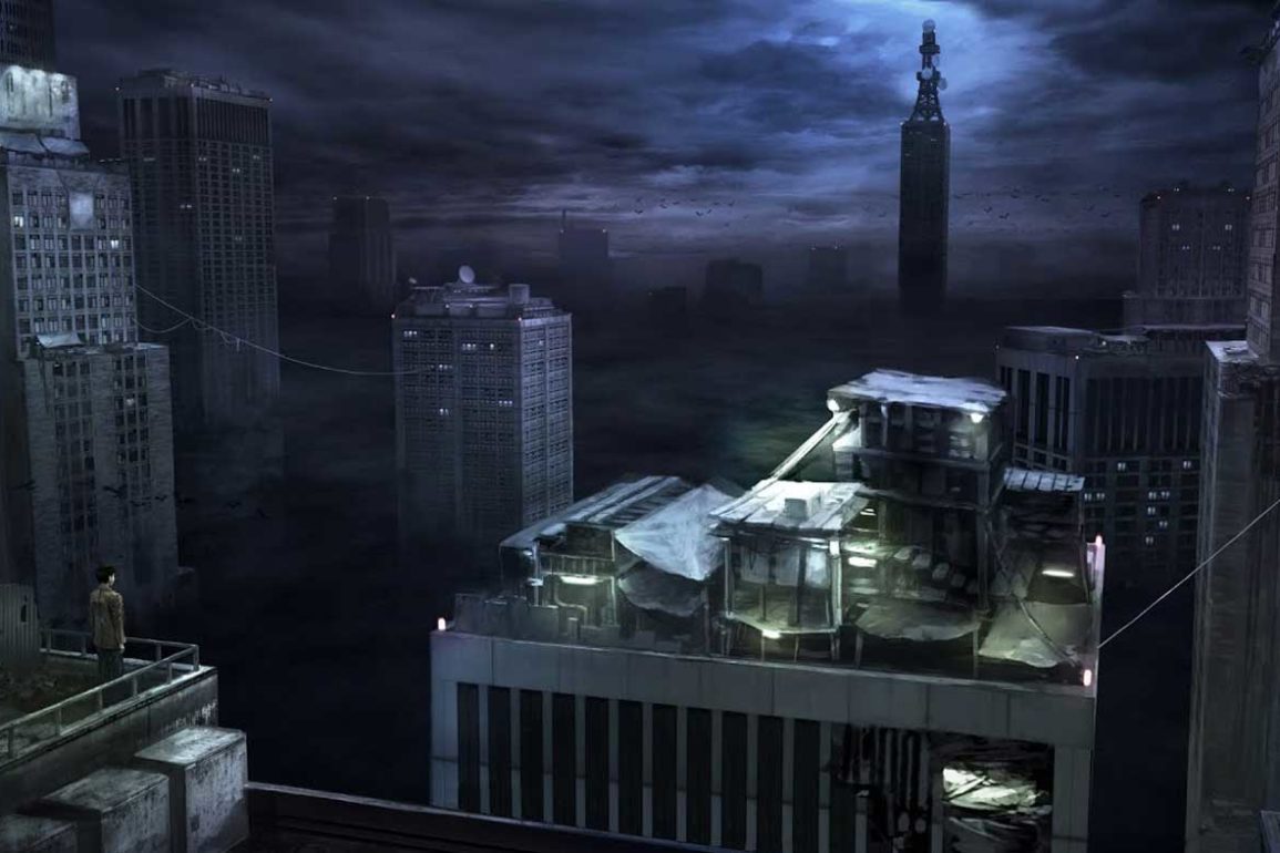
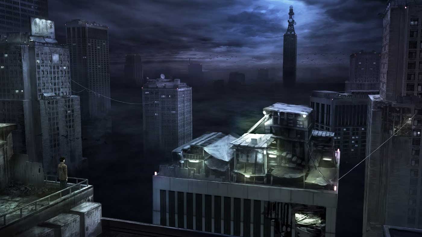
Back In 1995 sees you play as Kent, a man who has woken up on the rooftop of a building but is drawn to a radio tower in the distance of his city. It sounds simple enough, but a slew of strange monsters has started appearing out of nowhere, making Kent’s goal harder than at first glance. Back In 1995 attempts to use this simple story as a framing device for something much larger – a metacommentary on how the games of today play nothing like the games of yesterday and how the games from generations ago evoke a certain feeling. I totally get what the game is going for, but it falls flat because the game itself fails to capture that nostalgic feeling of the games it’s imitating.
If you hadn’t worked out yet, Back In 1995 is designed to resemble classic survival horror games like the original Resident Evil, Alone in the Dark and Silent Hill. The controls are unruly, what we call tank controls today, and the cameras are at a fixed perspective rather than controlled. It’d sound like a mess for anyone whose gaming canon started at the Xbox 360, but it’s intended to appeal to those who have been playing since the early 90s. Unfortunately, the biggest problem with Back In 1995 is that while it does a great job at emulating all these aspects of older games, it doesn’t quite understand why they were great in the first place.
Controls are important in any game, especially in a survival horror game like Back In 1995. Like the older Resident Evil games, you move forward by pressing Up while using the Left and Right directional buttons to steer. It’s a system I grew up with and have since been able to get used to, but 1995 for some reason strips out the metaphorical grease in this machine. Other games would allow you to run through an area, only needing to more or less “steer” your character to relieve the monotony of the tank controls. While it’s explained away in a note found in the story, it’s a baffling decision to not give Kent the ability to run, especially in a game where you might get stuck exploring.
I say exploring, but there are times where Back In 1995 gets incredibly dry. And that’s a lot to say for a game that lasts around two or so hours. Split into chapters that can gate you off from one area to another, the game fails to capitalise on the feeling of exploration and fails to reward memorisation of your world like games such as Resident Evil did with its memorable mansion. There is a little bit of exploration, but the critical path is so linear and diverges so little that it fails to really keep your attention for its short runtime.
This is compounded by a rather lackluster set of enemies that rarely pose a threat to you. There are around four different types of enemies in 1995, and they all meander around the world so casually it’s hard to fear them. One moment where three enemies cornered me and stun locked me to the point where I couldn’t do anything was more frustrating than anything, and enemies as a whole take what feels like minutes to begin and land an attack. They’re slow, they’re uninspired and they barely added anything to the experience Back In 1995 is trying to emulate.
The one thing Back In 1995 nails is the look and feel of the game, which is meant to remind you of horror games you played on the original Playstation in the mid-90s. Textures are low quality, some are even stretched bizarrely to distort them too. This is an authentic looking recreation of other games, but the effect is almost taken too far to the point where the texture warping when combined with the moving camera is bound to be nauseating for some players. The sound design lacks this same dedication to authenticity, however, and while atmospheric at first, the repetition of the music means it becomes grating rather than tense.


