

Press Start may receive a commission when you buy from links on our site at no extra cost to you.
Xbox is making an effort to improve its console dashboard – something that’s seen a few iterations and seems to have settled into a recognisable design language but definitely still has some room for tightening and cleaning up.
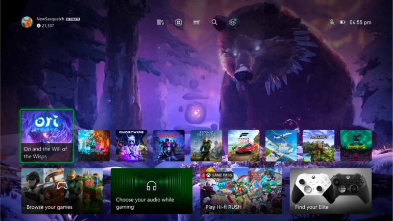
Rolling out now to certain tiers of Xbox Insiders, the new iteration of the Xbox Home screen gives users a ton more space at the top to admire their backgrounds, mostly by shrinking down the top row of game tiles – which also means you’ll have more games visible at a glance. There’s also a new feature that can dynamically update the backdrop based on the game tiles you’re hovering over.
According to Xbox, in total this new version of Home:
- Provides easy navigation to your library, the Microsoft Store, Xbox Game Pass, search, and settings at the very top of your Home by introducing a new quick access menu.
- Simplifies the layout and makes more space for you to see your background by reducing the size of some of the tiles and moving them to the bottom of the screen.
- Adds a responsive game art feature to update the default background and show off the beautiful art associated with each title when you hover over the tiles.
- Adds a feature to the My Games & Apps tile to alert users when something new has been added to their library or the Microsoft Store.
It’ll be great to see other parts of the Xbox UX updated in the near future, but this first step looks a heck of a lot better than before, and you can see it in action in this video shared by Windows Central below. I’m particularly fond of the svelte little bar of icons at the top that looks like it gives easy access to your library, the store search, Game Pass and settings: